There is no shortage of excellent data journalism related to Covid-19. The best coverage I’ve seen so far has been from The New York Times and Our World in Data.
One thing I haven’t been able to find, though, are simple graphs that show new and total cases of Covid-19 in individual states. Mostly, I wanted to know if the number of new cases in Oregon is increasing each day, or whether we are adding about the same number of cases each day. This would be the difference between exponential and linear growth (more or less), which would help us predict what the coming days and weeks will look like.
In the interest of that goal, I build a little web application to track new and total Covid-19 cases in individual states. It pulls in current data from The Covid Tracking Project and displays it using line and bar graphs. As health authorities around the country update their data, the charts update, too.
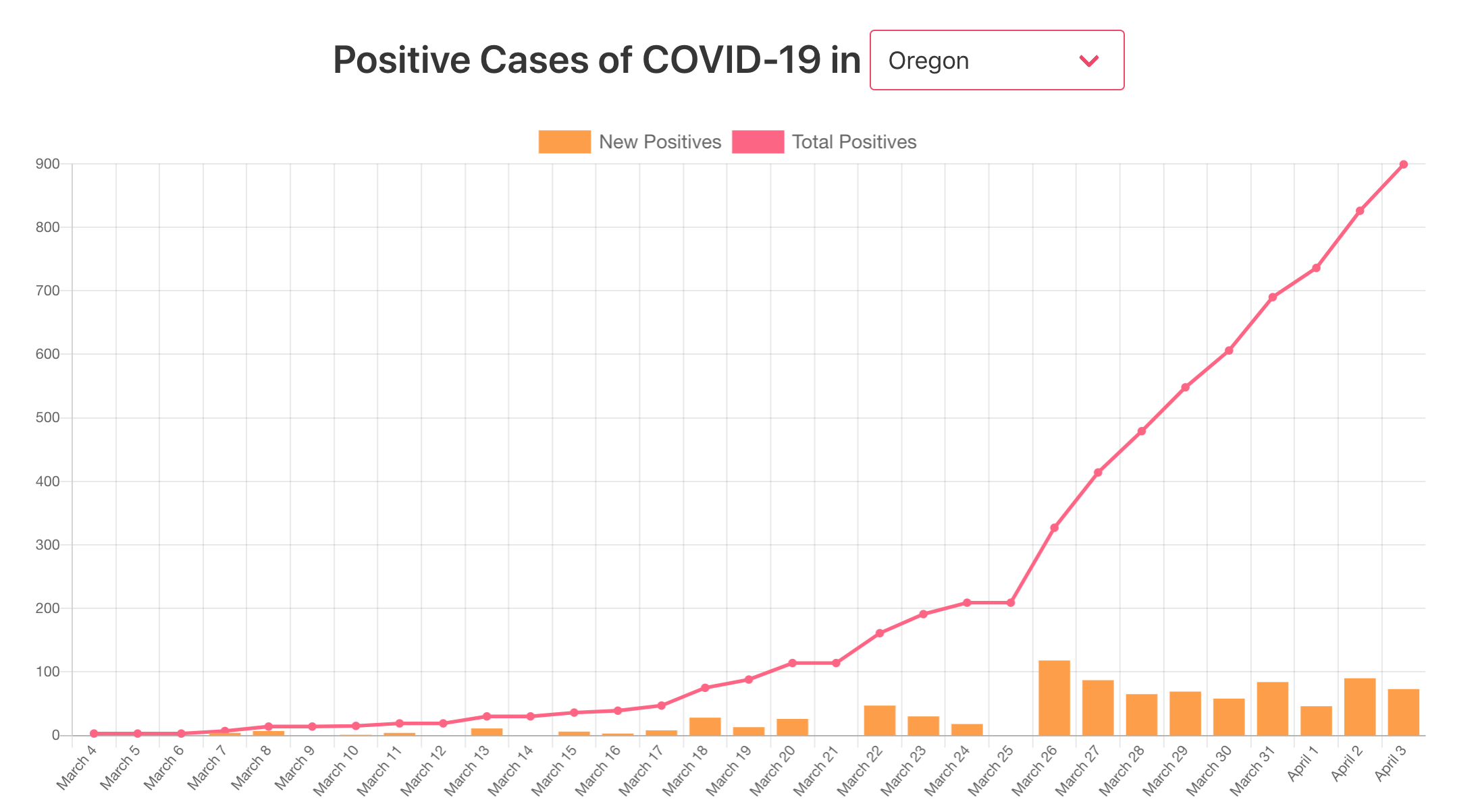 This is a screen capture of the application that I built. Click through to see it in action.
This is a tiny part of a giant picture, and as Nate Silver posted today, case counts themselves can be totally meaningless, but nonetheless, it’s a small project that I’m proud to have completed.